FILE SUPPLY GUIDE
WE WANT YOUR FILES TO
PRINT PERFECTLY
We want the same thing that you want. We want your graphic files to print without fuss and look like you meant them to. We’ll be honest with you – of the small number of jobs that don’t print as expected, the overwhelming majority are from files supplied to us. Even if you’re a seasoned professional and are used to supplying files for print, please read this guide anyway – our process is likely to be different to what you’re used to.
It usually takes our designers around 3 months with us to acquire the knowledge and understanding to correctly create graphic files for our print process. Whatever your print and design experience, whether you’re a novice or oracle, please read this guide in full before you start designing – it’s the best way to ensure that you don’t suffer any unnecessary delays, costs and heartache.
We want the same thing that you want. We want your graphic files to print correctly first time and look like you meant them to. Below are the minimum file supply essentials you need to follow.
If you are designing something more complicated like a booklet or a StarMarque/Spot UV product, contact us for a specific template
Is the Page Size and Bleed correct?
Remember to check the you have set your page size to match the product that you are ordering. Some products may have special sizes or bleed requirements. Most products generally have 1.5mm bleed on each edge, but there are some exceptions such as Booklets and Large Format Posters.
Artwork files should be supplied without crop marks.
Files supplied without a bleed will be scaled up to create the required bleed, which may result in printed elements appearing closer to the edge than expected.
Have you checked your Artwork Orientation?
Always choose a template appropriate to the orientation of your design; it’s best to have text reading ‘upright’ on screen. If it’s not possible to design the text ‘upright’ (maybe, you need a landscape front and a portrait reverse), then you must ensure the generated artwork’s front and reverse are oriented as you need. (We impose Right to Left, place pages side by side to check the orientation of your document.
Have you observed a Quiet or safe zone?
The quiet or safe zone may vary depending on the product ordered, you’ll need to check that you don’t have any important elements in this area. For most of our products we ask that all important elements are 4mm away from the cut edge, or 5.5mm away from the page edge. Elements within this area may appear closer to the edge than expected when guillotined and often result in an uneven looking design.
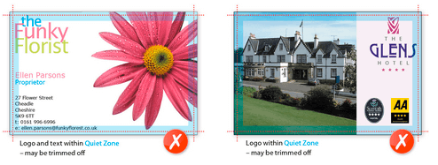
Designed margins
The use of designed margins or uniform borders near the product edge is strongly discouraged because guillotine cutting is not accurate enough to ensure that margins will be of the same width on every edge. Even a 0.5 mm movement in the guillotine blade will make the margin look uneven. Our guillotine tolerances are ± 1 mm for Litho Products and ±2 mm for Digital and Large Format.
Have you used the correct colour mode?
When saving your file, ensure that you have set the artwork up in the correct colour mode for the product that you are ordering. Most products are produced in CMYK process colour. If RGB or LAB colours are found they will be converted to CMYK which will result in some colour shift. We do not recommend supplying files in RGB or LAB as it's unlikely they'll print as expected. Pantone Colours will also be converted to CMYK (where applicable) with the same results.
Colour Tolerances/Variation
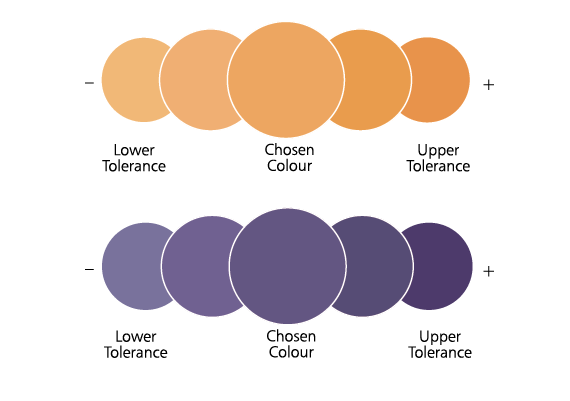
Colour variation is inherent in any print process, unfortunately an exact colour match cannot be guaranteed and should not be expected. The example below will give you an idea of how your chosen colour may actually look when printed. It's worth bearing this in mind when placing orders for multiple sets of business cards and reorders as colour variation affects each printed job and can also vary throughout a print run; due to air temperature, humidity and many other factors outside of our control.
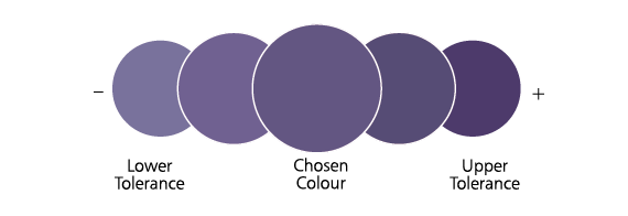
Colours made up of 2 or more CMYK colour channels increase the amount of variation you can expect to receive.

Example: 1 CMYK colour channel (Cyan)
Example: 3 CMYK colour channels (Magenta, Yellow & Black)
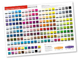
Colour charts are available for our main paper and card stocks and can be used to get a better indication of your printed colours.
Have you checked your ink levels?
Make sure all colours are below a 300% total ink coverage for coated papers and 225% for uncoated. Lower limits apply to some papers. Contact us for more information
Avoid Set-off, Misregistration and Banding
The rule of thumb:
• Avoid using more than one colour channel for Black Text (100% K only reduces the likelyhood of misregistration, which results from aligning multiple plates with fine details).
• Use a Rich Black (100% Black (K) and 40% Cyan OR 100% Black (K) and 40% Magenta) for areas over 2cm squared in size to avoid banding as single colour blacks can appear washed out when printed across large areas.
• Avoid using Colours with an ink limit of 225% for Uncoated Stocks and 300% for Coated Stocks to reduce the likelihood of set-off, which is when ink transfers from one side to the other during guillotining.
Cracking/Chipping
When paper is folded, its interlinking fibres are compressed on one side and stretched on the other. If the outer fibres lose their hold on each other, we see this as 'cracking': an opening out of the paper on the outside. This will be more visually apparent where the design includes a dark colour across the fold. If dark colours are required please upgrade to a Laminated Product which will help to reduce the appearance of cracking. This affects any product that is creased or folded such as Folded Leaflets, Creased/Shaped Flyers and Presentation Folders.
Check your image resolution?
Remember to check the requirements for the resolution of images, as it may vary for different products. For CMYK process printing, your colour images should be set to 300dpi @ 100% size.

Correct number of pages?
Ensure that you supply us with the correct number of pages in your file. You can supply your pages as individual PDFs or as a multiple page PDF. Page 1 should be supplied as the front design, page 2 the reverse and finishing on page 3 where appropriate.
File saved in the correct format?
Remember to check that you are saving your file in the correct format for the product that you are ordering. We would prefer you to supply us with a 'Press Quality' PDF (Compatability: Acrobat 5 (PDF Version 1.4) or later).
InDesign templates are available for 99% of our product range. Templates offer an "assured" starting point for your supplied files. Contact us for the correct template for your chosen product.
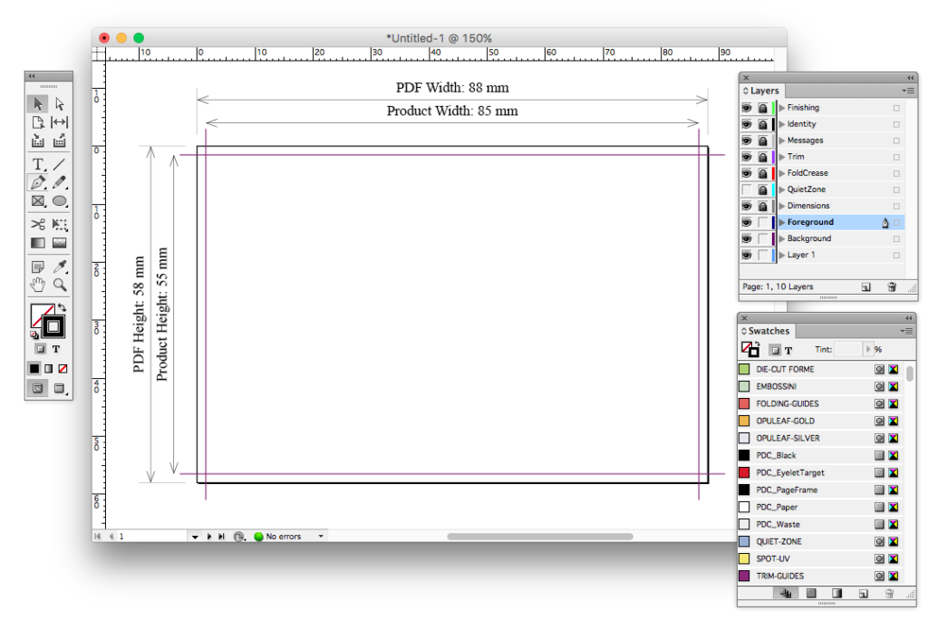
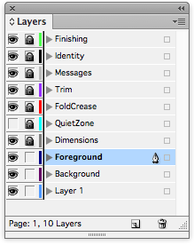
InDesign layers
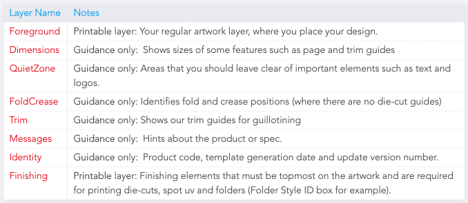
Quiet Zones
It's best practice to leave a 3 to 5mm margin (Quiet Zone) between your text and logos and the trimmed edge for Litho printed jobs.
Booklets, Banners and Fabric products have much larger Quiet Zones.
The Quiet Zone is marked in the blue QUIET-ZONE colour, on the QuietZone layer. This layer is hidden by default, and can be revealed by clicking on the ‘eye box’ (leftmost column) next to the QuietZone layer in the Layers palette.
The Quiet Zone Guide should not appear on the "Print Ready PDF" and is removed by our FileCheck Software.
Trim Guides
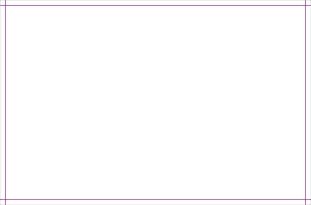
These are marked in our purple TRIM-GUIDES colour, on the Trim layer, showing where the product will be trimmed. The tolerances for guillotining are -/+1mm. These elements should not appear on the PDF you send to print.
The Trim Guide should not appear on the "Print Ready PDF" and is removed by our FileCheck Software.
Fold Guides
These are marked in the FOLDING-GUIDES colour, on the Fold layer, showing where the product will folded. The tolerances for folding are -/+1mm. These elements should not appear on the PDF you send to print.
The Folding Guide should not appear on the "Print Ready PDF" and is removed by our FileCheck Software.
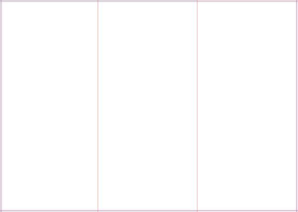
Mini Brochures and folded products
Red page frame for front panel
A red page frame is drawn to indicate the front panel on the finished item.
The Red Page Frame Guide should be present on your "Print Ready PDF".
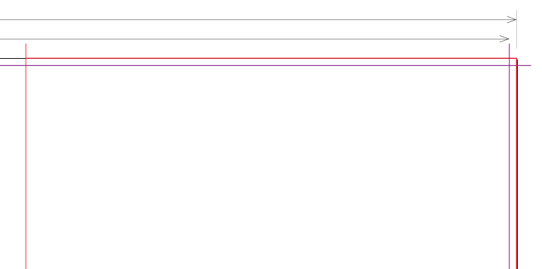
Perforation
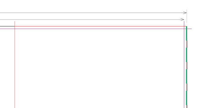
Where a simple perforation option is specified on leaflet products, the parallel edge closest to the perforation is marked with a dashed green+white line.
The Perforation Guide should be present on your "Print Ready PDF".
Die-cut, creased, embossed, and spot-UV products
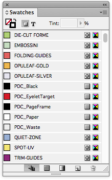
All of our templates include our die-cut, spot uv, gold or silver foil spot colours.
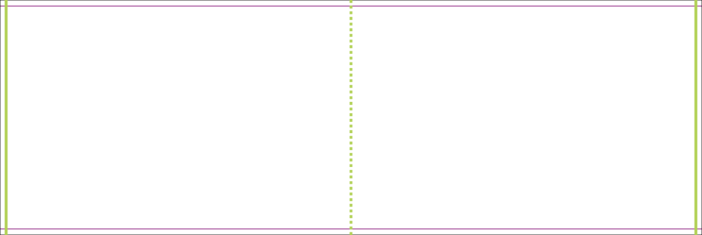
Die-cuts
Add 2pt Strokes to the Finishing layer, using swatch colour: DIE-CUT FORME.
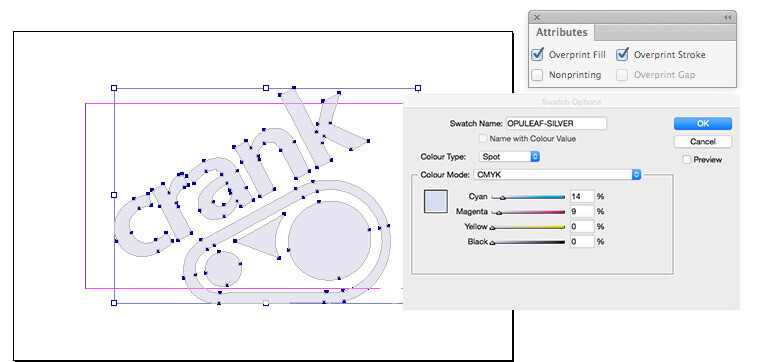
Foil
Add solid shapes to the Finishing layer, using swatch colours: OPULEAF-GOLD or OPULEAF-SILVER.
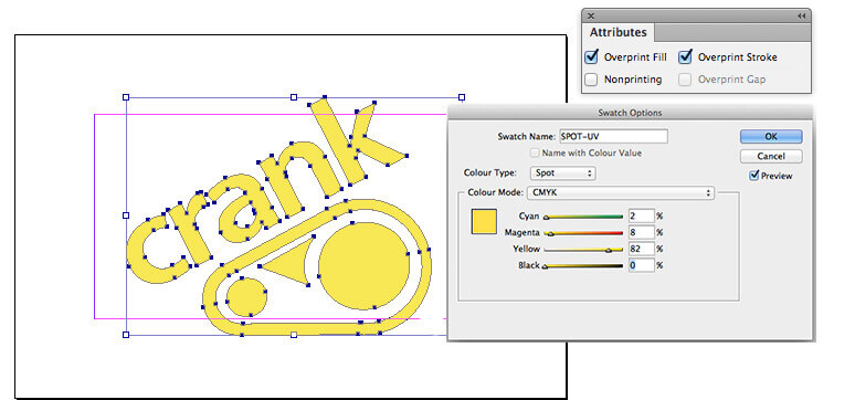
Spot-UV
Add solid shapes to the Finishing layer, using swatch colour: SPOT-UV.
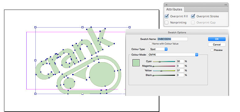
Embossing
Add solid shapes to the Finishing layer, using swatch colour: EMBOSSINI.
Large Format only
- 2 pt Page Frame on the Finishing layer
- 10 mm Quiet Zone.
Eyelets
For Banners having eyelets, TGI will place eyelets with the correct spacing. This also works with custom-sized Banners.
It’s very important that you set your page size correctly. If you don’t, parts of your design may be chopped off, look off-centre, or have areas of undesired white space. Here’s what to do:
How to set page size
1.Locate the product size you’re interested in
2. Make a note of the Page Size. This is the size you should set your page on your document.
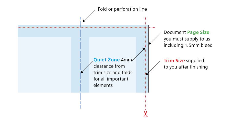
3. Now look at the Trim Size. You’ll see that this is 3 mm smaller on both dimensions. This difference is known as the ‘bleed’ – 1.5 mm on all four sides – that’s approximately where our automated guillotines will make their cuts. The bleed allows for any small variations in during the cutting process. We recommend that if possible no objects extend beyond the page size – use the ‘paste inside’, ‘clip’, or ‘crop’ tool.
4. To remind yourself where the cuts will be made, you could add some guidelines 1.5 mm in from each edge on your document.
Business Card Example
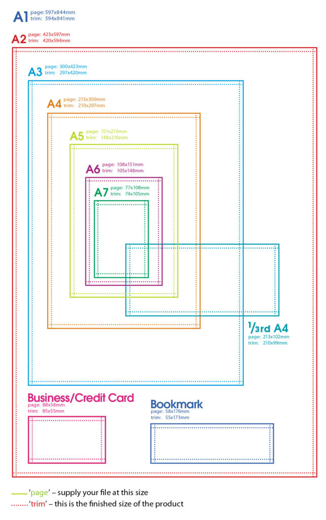
Here’s an example of a business card, you’d set your page size as 88x58mm. We’ll trim down to approximately 85x55mm.
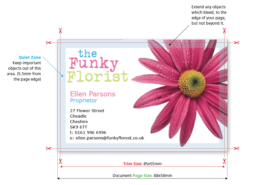
5. It’s also good practice to leave a ‘Quiet Zone’ (or safe area) of 4 mm from the trim edge (that’s 5.5 mm or 11.5 mm from the page edge).
The same goes for any folds or creases. Avoid placing any important objects such as text or logos within this quiet zone. This will make your job look more professional and ensure objects don’t look like they’re about to fall off the edge.
Diagram of bleed and quiet zone
Crop Marks and Colour Bars
We don’t require the normal colour bars and crop marks that printers use, so remember not to include them on your PDF.
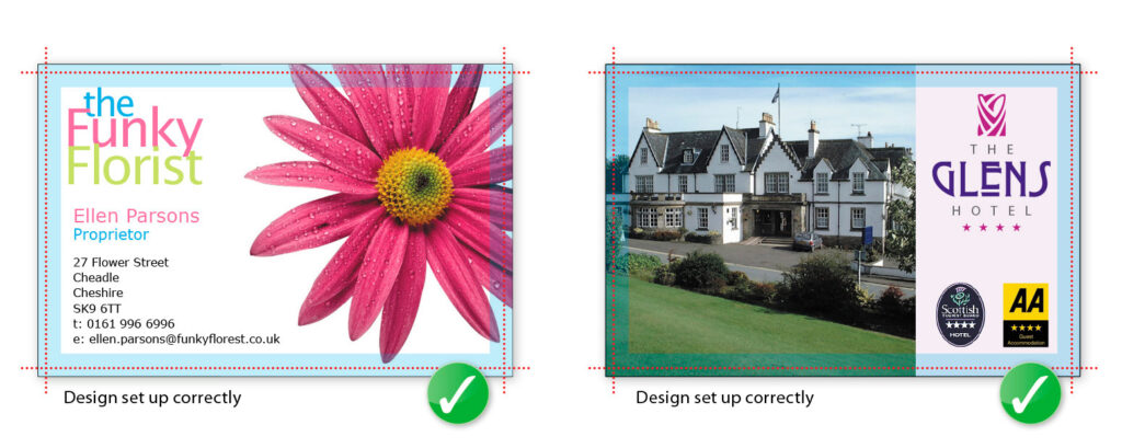
Allowing for the correct bleed and quiet zone are really, really important and they are some of the most common file supply errors that we see. Here are a few examples of how to get it right (and wrong!):
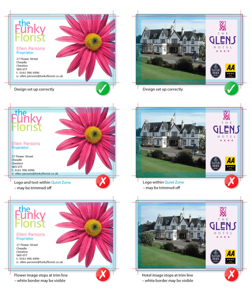
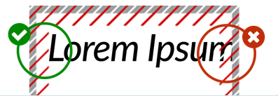
When viewing your Online Proof the QuietZone is indicated with Red and White Guides. The Bleed is highlighted in Grey.
Objects that enroach our recommended QuietZones may appear closer to the edge than expected once printed.
Always choose a template appropriate to the orientation of your design; it’s best to have text reading ‘upright’ on screen.
If it’s not possible to design the text ‘upright’ (maybe, you need a landscape front and a portrait reverse), then you must ensure the generated artwork’s front and reverse are oriented as you need.
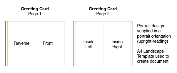
The following examples show how your files need to be supplied, in order for them to print with the correct orientation:
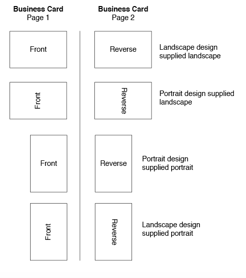
Do not submit one landscape and one portrait side. Instead, rotate the artwork of one of the sides to conform to one of the examples shown here – make it fit a standard template.
Greeting Cards, Folded Business Cards and Folded Leaflets/Flyers
Be sure to check in the special case of ‘Greetings Cards’ products, especially the inside orientation of landscape cards.
As we impose from left-to-right, the message inside will print on the panel opposite to the reverse. Your files if set up correctly should look like this (the recommended option):
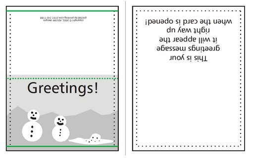
You can also supply like this:
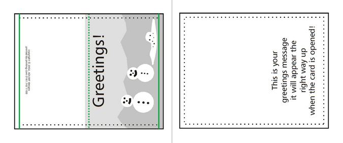
Or like this:
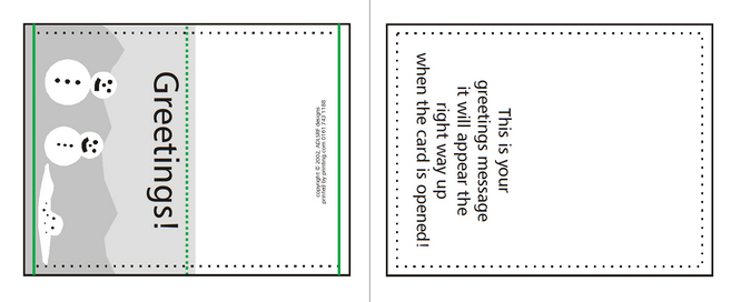
Your Portrait Greeting Cards will look like this:
Here are the common metric page sizes.
Your computer, scanner, digital camera and monitor create images using combinations of just three "RGB" colours:
- Red,
- Green, and
- Blue.
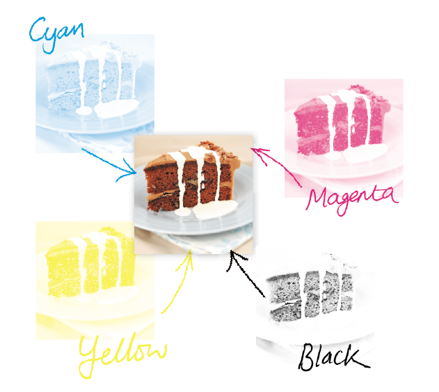
Printing presses use four different colours to print these images:
- Cyan (light blue),
- Magenta (pinky red),
- Yellow, and
- Black
This set of inks is know as "CMYK ", or "process colour".
Converting to CMYK
At some stage of production, RGB images and colours must be converted to CMYK.
Your PDF file needs to be supplied in CMYK process colour, not RGB, Index or as Spot Colours. We can do the conversion for you to CMYK, but you will have more control of it if you manage the conversion before creating your PDF. When converting to CMYK be aware that some RGB and Spot Colours don’t have a direct CMYK conversion, and thus some colour shift may occur.
Conversions on images from RGB to CMYK are best done using software such as Photoshop and you should do this before sending your file to us. If you don’t perform the conversion yourself, our process will apply an industry standard profile RGB to CMYK conversion meaning that colours may not print as expected.
Screen versus Print
Due to the differences between a computer screen and a printed item what you see on your screen may be different to your printed product. This is because computer screens have light showing from behind them whereas paper doesn't.
Be careful with colour
To create a good solid black, use rich black instead (C20 M20 K100). Don’t use four-colour black and it’s best to avoid solid colours of only one ink (i.e. pure cyan, magenta, yellow or black) as these can be susceptible to slight “banding”. Using rich black avoids banding.
You’ll get best reproduction from colours that are made up from one or two inks (i.e. magenta and cyan etc). When using lighter shades, avoid tints that contain less than 5% of either Cyan, Magenta, Yellow or Black, as they usually print much lighter than they appear on screen and you may be disappointed with the outcome. For best results, use tints containing 5% to 30%.
Getting the best from CMYK
Try to avoid large areas of the same colour – that’s where colour issues (banding, ghosting etc.) becomes most noticeable. Try to break up large areas of colour with alternate elements or add a background image. Vignettes, or gradient fills are best avoided – they have a tendency to show ‘banding’ and look unprofessional. The Adobe® website offers some advice on gradients if you wish to use them.
Colour Tolerances
You can produce fantastic results with full colour process – and without breaking the bank. It pays to bear in mind that colour variation is inherent in any print process and you shouldn’t expect a perfect match to your chosen colour. The examples below will give you an idea of how your chosen colour may actually look when printed.We’d be delighted to explain this in more detail – just ask.
Ink Levels
To get the most from your print, we have set some recommended maximum ink levels. For coated papers (such as business cards, flyers and leaflets) we recommend a maximum of 300% total ink coverage. for uncoated papers we recommend a maximum of 225%.
To optimise your images you'll need to consider the final size your images will be used at. Photographs should be 300-350dpi at the size you are going to use them. There’s no point taking a postage stamp sized image at 300dpi and then blowing it up to a A4 size. Conversely, photographs at more than 350dpi will have no effect on the actual printed quality and will unnecessarily increase file size and processing time.
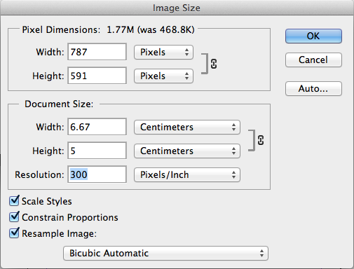
Image settings for best results
- All images should be converted to CMYK, and then saved as psd TIFF or JPEG files;
- Photos should be scanned at 300dpi at 100% size;
- Line-art images should be scanned at 800 to 1200dpi at
100% size; - TIFF and EPS files are saved without any image compression (not JPEG, LZW or ASCII encoded);
- Any extra alpha channels are removed;
- Ink coverage below total ink limit.
Photoshop psd files
Adobe Photoshop psd files can be used in your PDF file, but you will need to save the PDF as a version 1.4 PDF or later. If you are saving as a version 1.3 PDF then you will need to flatten the images when your PDF is created.
Today’s graphics applications are incredibly sophisticated. So much so, that some may contain features not compatible with the latest developments in printing technology. Likewise, some things can look great on screen, but not when printed. Based on our experience, we’ve prepared a list of items that we know can cause problems. So please, follow the advice below.
Hairlines
Hairlines are ‘device dependent’. This means that they print at different resolutions on different machines. They may print fine on your 300dpi laser printer, but will disappear on our 2400dpi plate-setter. Use 0.25pt instead.
Texture and Postscript Fills
These print erratically, it's best to save them as a TIF or JPG instead.
Layer Effects And Transparency Effects
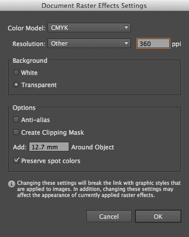
If you are using layer and transparency effects in your artwork then you'll need to supply your PDF as a version 1.4 PDF, this will ensure that any layer and transparency effects are honoured. If you are saving as a version 1.3 PDF then your Transparency Flattener preset (in both InDesign® and Illustrator®) will need to be set on high resolution setting ready for printing, and then applied when creating your PDF;
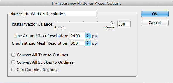
In Illustrator® the Raster Effects Settings will also need to be set towards vector :
Overprint
Be careful with overprint settings (especially in QuarkXpress). If you set objects to overprint, they will not ‘knock-out’ the background, and will look very different to what you see on screen or proof. Black text generally defaults to overprint, (as does the 100% black swatch in some applications). This is usually OK. Please refer to your application manual for more details.
Duotone/RGB images
These may print in black and white, or with washed out colours – always convert to CMYK.
Borders
Some movement during the guillotining process is inherent. You should not expect the space between a border and the finished guillotined edge to be the same on each edge. This can lead to an uneven and unprofessional look to the artwork. Even half a millimeter of movement can be noticable, especially on smaller products such as business cards.
Gradients
Vignettes, or gradient fills are best avoided – these are difficult to print and they have a tendency to show ‘banding’ and look unprofessional. There is advice on gradients in the Help section on the Adobe website which you may find useful.
Watermarks
Be careful with using watermarks, if they’re too heavy it can make text or writing difficult to read. We recommend using a tint between 5%-7% for the best results. We cannot guarantee to print below 5%.
Aligning elements to folds
Avoid trying to line up design elements with folds or creases. There’s a chance they may not land perfectly on the fold or crease which can look unprofessional.
HOW SHOULD WE WORK TOGETHER?
We’re all different.
Some of us are more different than others. That’s why we work with our customers in lots of different ways, depending on their level of file supply expertise. If you don’t know your Quark from your elbow, then let us take care of the design for you. It’s safest that way. If you’re an “amateur-dabbler”, then you’ll probably need to rely on us to Make Your File Work. At the other end of the scale, if you know what you’re doing and can follow our process, we’ll happily check your file for you. Where are you in this chart?
WE’LL DESIGN FOR YOU
WE’LL MAKE YOUR FILE WORK
WE’LL CHECK YOUR FILE
WE’LL LET YOU RISK IT
WE'LL DESIGN FOR YOU
Creating effective design is more important than saving a few quid trying to botch it yourself. Feel free to mock something up in Word, send us digital images or leave it entirely up to us. Ask us for a price.
WE’LL MAKE YOUR FILE WORK
Someone else created your design then gone backpacking round Australia? Don’t panic.
Give us what you’ve got and we’ll do our best to Make it Work
WE’LL CHECK YOUR FILE
Follow all the advice in our guide, send us your file and our Hand-Holding service will run technical checks to look for potential problems.
WE’LL LET YOU RISK IT
When you’ve been supplying
files to us correctly for a while, it may be right for you to become a File Risker. But only if you’ve been good.
